Chart plugins
What is this
A chart plugin defines one ChartType — a way to turn parameters and a dataframe of logged data
into a rendered Dash component. ChartType[P, D, C] (dlboard/models/_view.py) is generic over
its parameter model P, the data shape it renders from D, and the rendered component type C.
Built-ins: line_chart.py, bar_chart.py, table_chart.py, image_series.py, file_list.py,
histogram.py (dlboard/plugins/charts/). file_list.py is what an artifact a browser can’t show inline gets (a
checkpoint, say): its files by run and step, each with a download link. It is paged and sortable, and
splits files into tabs by what they are – for the checkpoints DLBoardLogger uploads, Latest, Best
and Top-k, read from the tag and score tags the logger records. Set key_prefix (say
checkpoints/) instead of key and one chart lists every key under it, so a run’s hundreds of
checkpoints (one key apiece) are one list, and Auto-generate makes exactly that.
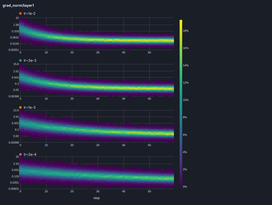
histogram.py charts a logged histogram (see Client & logging: values binned in your training
process, so only buckets are sent) as it changes over steps – per-layer gradient norms or weights, a distribution
of per-sample losses – without averaging it away. A display setting picks the view: heatmap (the default;
step across, value bucket up, shaded by the share of that step’s values in the bucket, in a colorscale of your
choice), bands (the median with the middle band_share of the values – 0.68 by default – and the min-max
around it, per step) or step (the distribution at one step as bars, with a slider to move through the steps).
Each is one figure with a row per run, labelled with the run’s name and the color it has everywhere else, and a
panel’s charts-per-page limits how many rows: the most recent runs are shown. normalize (on by default) shades
each step as a share of its own values so steps that logged different numbers of values compare; turn it off for raw
counts.
Whatever was logged, a chart is cheap to open, and each bound is a setting. It reads about
DLBOARD_MAX_HISTOGRAM_STEPS (256) steps per run: the store thins a longer run to every 2ⁿ-th step from its first
(keeping its latest too) before anything is read back, so a run that trained for a million steps costs the same to
open as one that trained for a thousand, and the steps shown stay put as it trains rather than shifting on every
refresh. It draws at most max_rows (128) value buckets per run, merging a finer lattice, and the step view’s
slider moves through at most max_slider_steps (300) of them. The accent color of the bands and bars, the space
between rows, the ticks named on a value axis and the default shape are DLBOARD_HISTOGRAM_* settings, listed in
Configuration. Auto-generate makes a heatmap for each histogram key.
table_chart.py is a data table. Two settings shape it: what a row is (rows), and which columns it
shows (show_metrics, show_hparams, show_artifacts).
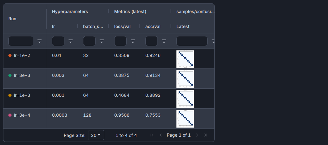
rows: run(the default) is a row per run: its hyperparameters beside the latest value of each metric – each metric’s own latest, as in the Runs table, not whatever was logged at the run’s last step – and its latest artifact under each key shown, with the tags.aggregateswaps “latest” for the first, minimum, maximum or mean of a metric.rows: fieldis a row for each value of a metric,row_field(step,epoch, …). By default each run has its own rows; withspread_by_runthe runs sit side by side, a column group each, which is how to compare a metric across runs. Anything a run logged between two values of the row field belongs to the earlier, sorows: field,row_field: epoch,spread_by_runandshow_artifacts: [samples/*]is a row per epoch with each run’s latest image of that epoch.rows: artifactis a row per logged artifact, beside what its run logged at that step, with each tag a column that sorts and filters as the number or text it is: the way to find a sample among hundreds.
Each show_* list takes names, or a prefix and a * for everything under it: eval/* is a column for every
key starting eval/, including ones logged later, and * alone is all of them. The metrics and hyperparameters
start at *; an empty list shows none, so a table of only artifacts is one. An image is a thumbnail linking to
the full one; any other file is a download link. Runs are named and colored as in the charts and the Runs
table, every column filters in place, and a table keeps its sort, filters and page when a live update
redraws it. A table saved with the earlier mode settings (runs, pivot, artifacts) opens as the rows
and columns that show the same table.
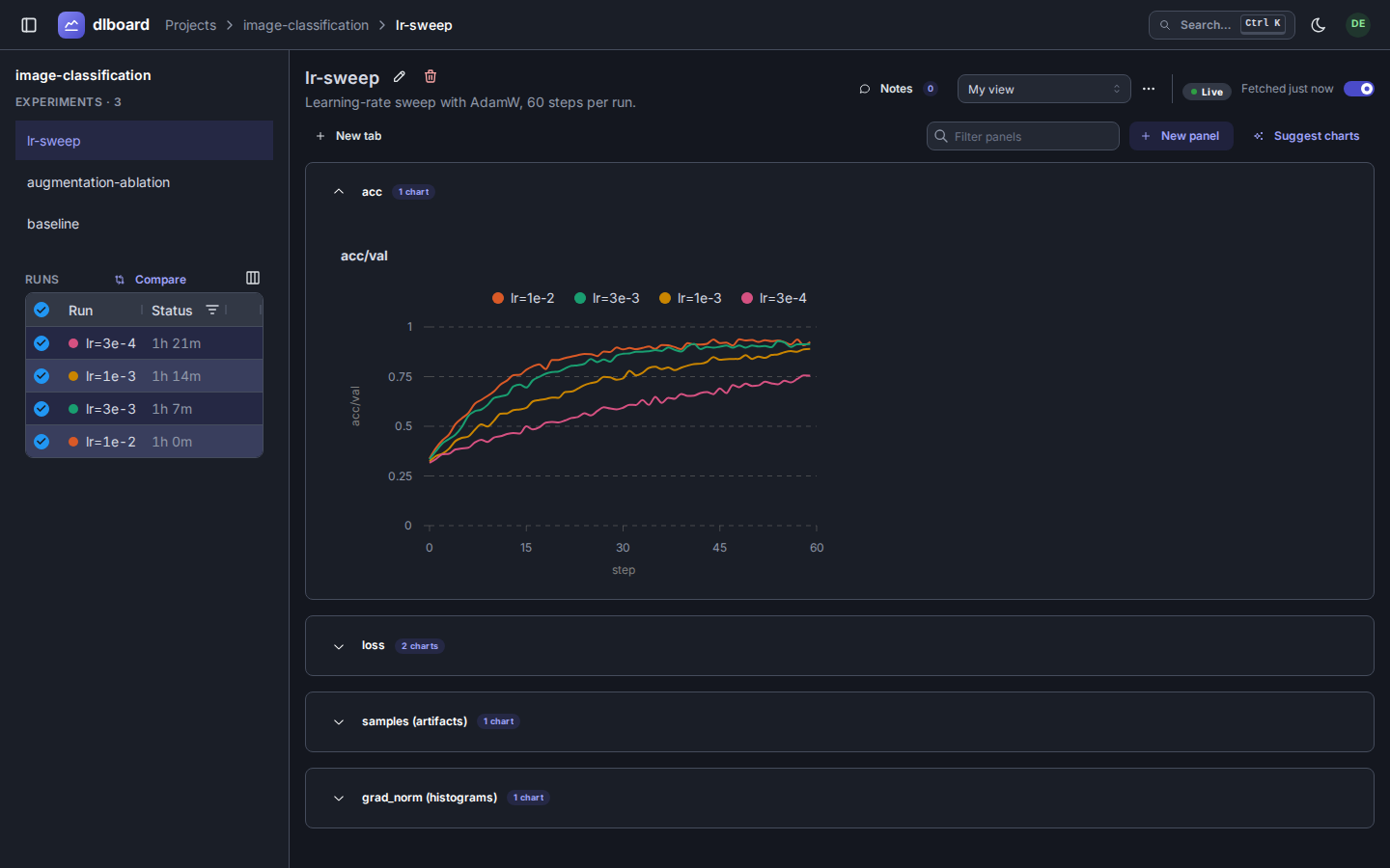
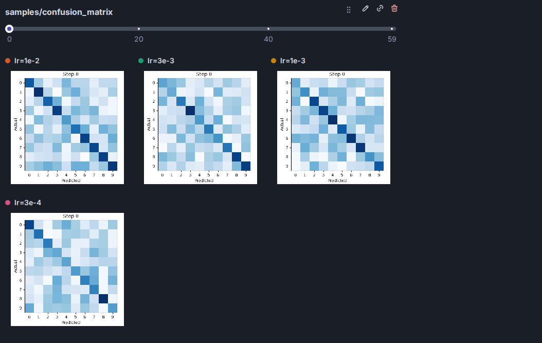
The built-in line charts, and the image series that steps through logged images:
A table of runs, with an artifact column:
A histogram chart’s heatmap, one row per run (here the gradient norms of a layer shrinking and tightening as four runs converge):
When you’d need this
You want a new way to visualize logged metrics/artifacts that the built-in line/bar/table/image/histogram charts don’t cover — a scatter plot, a confusion matrix, anything with its own parameter shape and rendering.
How do I build one
Subclass ChartType and implement its abstract methods:
name: ClassVar[str]— the registry key. Must be unique (see below).parameter_type() -> type[P]— the Pydantic model describing this chart’s settings.render(parameters, dataframe) -> C— turn one instance into a Dash component.hint_required_columns/hint_required_artifact_keys/hint_required_hparams— tell the chart-autogen logic (dlboard/serve/_pages/_experiment/_chart_autogen.py) what a logged run needs before this chart type is even offered.hint_required_artifact_key_prefixes(optional, none by default) — for a chart that lists a whole family of artifacts (everycheckpoints/...key) rather than named ones: every key starting with one of these is fetched, including keys logged later.hint_required_histogram_keys(optional, none by default) — the logged histogram keys the chart shows. A chart always names them: there is no “every histogram”, because a histogram is the most expensive thing a panel fetches. A field naming one is aColumnKind.HISTOGRAMinfield_column_kinds().
The same hints bound what the experiment page fetches: a panel shows one page of its charts, and only
those charts’ columns and keys are requested. They are also what the panel’s chart filter matches
against (a fuzzy match on each metric and artifact key, and on the chart type), so a chart type that hints
accurately is both cheap to page and easy to find. A chart whose hint is None (“everything”) is found by
its chart type alone.
field_column_kinds()— map each parameter field to theColumnKind(metric/artifact/hparam) that populates it, so the settings UI knows what to offer as choices.can_display_artifact(artifact) -> bool(optional,Falseby default) — say which logged artifacts this chart type can display. Auto-generating and suggesting charts give an artifact key the first built-in chart type that says yes; an artifact no chart type claims simply gets no generated chart.
plug(app) registers the class and, if the chart needs its own clientside JS (a tooltip
formatter, say), serves it from a route this plugin owns:
def plug(app: Dash) -> None:
    MyChart.register(allow_override=True)
    # optional, for chart-local JS: served from this app only, cached forever under a content hash
    serve_asset(app, AssetKind.SCRIPT, _JS_PATH.name, _JS_PATH.read_bytes())
Always pass allow_override=True — the composed app can get built more than once in a process
(tests do this legitimately), and ChartTypeRegistry.register raises on a second registration of
the same name unless told it’s expected. line_chart.py/bar_chart.py/table_chart.py/
image_series.py are all consistent about this; follow their lead.
If your chart needs its own browser-side JS, keep the .js file next to the chart module and
serve/register it from plug() yourself, the way bar_chart.py/line_chart.py do for their
tooltip formatters — never drop it in a shared assets/ folder or use Dash’s global
hooks.route/hooks.script registry, both of which leak across every Dash app built in the same
process, not just the one that owns the file.
bar_chart.py is a good mid-sized reference: one settings model, one JS tooltip asset, grouping
logic shared from _grouping.py.